UX, UI, Prototype
Amazon 2.0
A personal take on reimagining Amazon's shopping and browsing experience.
Role
UX, UI, Prototyping
Tools
Figma
Year
2024
Agency
N/A

Adopting Design Trends
Amazon is a powerhouse in online shopping and profit. It has remained a success for over 30 years and with that, their online service has evolved. However, despite its constant growth, their product's design is constantly trailing behind the mark. Many users get frustrated with its cluttered and inconsistent. It’s as if Amazon is shouting, “If it ain’t broke, don’t fix it.”
Amazon is years behind its competitors in terms of UI, and many other online stores continue to advance. So, how can we get Amazon’s design mojo back?

Simply Overwhelming
Amazon’s design is simply not friendly engaging. Even though they give great shopping recommendations, they are either hard to find or heavily repetitive. Plus, the app and web experiences are not cohesive with one another, making it hard to find things in the same place. They each feel like different products.
I asked around to get other people's feelings on Amazon’s platform and many have their own struggles. One said they don't even look at reviews anymore because they are hard to find. Another stated they simply look for deals and leave. One common comment was that the homepage is not that useful. With this in mind, I wanted to test my design skills.

Refreshing Amazon
🗣️ The Ask
How do I make Amazon’s experience visually elegant, taking into account current trends, while remaining simple and cohesive between both web and app?
⭐️ The Goal
Basically, figure out an answer to the pressing question through trial & error, and taking inspiration from competitors.
Crafting Consistency
My biggest goal was to tackle both the website and the app so they spoke the same language. The main contender in making that happen was crafting a tight-knit design system. I used atomic structure to organize each layer of UI.
To also make this little sprint short, I narrowed in my focus to the main key pages of Amazon's site that each shopper would come across.

Making Shopping Feel Easy
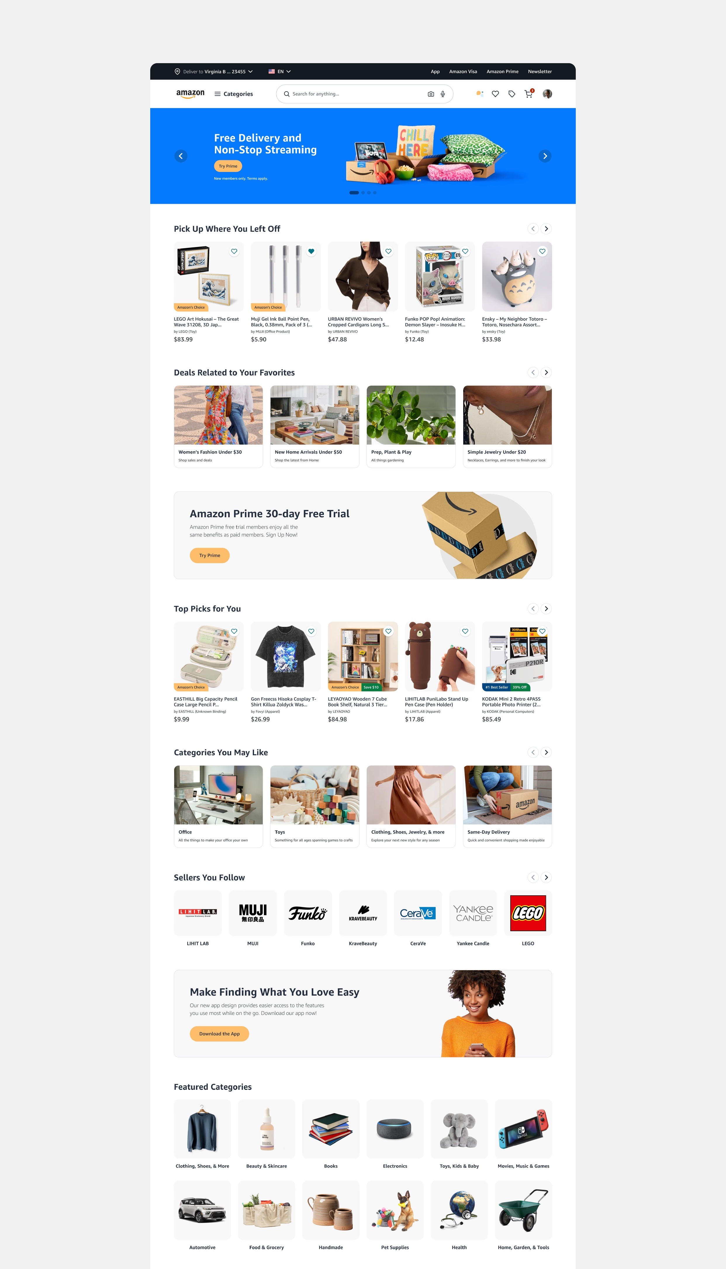
After evaluating my findings, gathering inspiration, and fleshing out the design system, a new version of Amazon was born. Amazon 2.0 if you will. I focused on these select pages:
Homepage
Search Results
Product Overview
Cart
Checkout
Confirmation
Favorites
Orders
Account


Sharing Around
After finishing the design, I shared it with a few individuals to get their opinion. Surprisingly, they has pretty nice things to say.
“Ooo that's nice, bringing Pinterest to Amazon. I see you. It looks really good, no cap.”
“It's soooo much cleaner and easier to understand than Amazon's current situation.”
“Wow, this isn’t a website?! I would honestly like for Amazon to do some of this!”
The Team
Makayla "MK" Perry
Designer
Made by yours truly


